Developed HCI: Mock-website Design and Prototype
CarRange
SPRING 2024 Semester Project, HCDD 264
A collaborative effort by Skyler Koba, Henry Adams, and Tianna Samal
Timeline: 12 week sprint January/May 2024

Project Overview
Project Overview
Imagine that you, a college student on a budget, just crashed your car. Maybe you’ve never had to look for your own vehicle before, and you can feel the panic setting in: you need your car! For your job, your commute to school, and going to the grocery store.
While there are websites that sell cars online, there tends to be a scattering of basic information. When you know nothing about a subject, who do you go to? What do you ask? There is an inherent problem of too much, inaccurate information when searching for a car online.
Our Solution
A mock website where users can buy and sell cars in addition to providing all the resources and aid they might need during the car selection process. Users can choose to join message boards, apply for loans, and much more.
***NOTE: The demo is from a point where I knew less about Figma and resolution sizes. Currently the demo is WIP fixing sizing elements, so if it appears a bit wonky, I apologize!
Timeline
Design Thinking Model
Week 1 & 2: Empathize
Secondary Research
To kick off the project, our team conducted secondary research into user groups by analyzing online communities such as Reddit and Facebook Marketplace, as well as articles and videos.
Interviews
After conducting secondary research, each of our team members interviewed 2 individuals for a total of 6 interviewees to collect primary data on our stakeholders. We used the data from our collective research to inform our decisions going forward.

Week 3-6: Define & Ideate
Stakeholder Analysis & Journey Mapping
Activity: Performing a Stakeholder Analysis to rank their priorities and interests based on previous research. Then, using the Stakeholder Analysis to begin creating a potential journey map for our user groups.
Result: Better understanding the needs of our stakeholders and how to address them through a potential solution; being able to organize data into something that can be developed into a sketch.
Story Boards
Using our observations from our previous activities, each member of our group developed story boards per main use cases as outlined on our journey maps. These story boards operated similarly to wireframes, while keeping a specific user story in mind.
Our results helped us better define what potential features and information should be represented in a visual design.

Week 7 & 8: Prototype
Sketches
For the prototyping stage, we individually focused on different use cases from our previous stage to develop into sketches and mockups. This step was crucial in understanding what potential interfaces may look like for a solution.
Mockups
When we nailed down our concept from our sketches, we moved on to developing our use cases into more fleshed-out mockup designs. These would eventually inspire our integrated prototype.
Design Guide
After reviewing each others mockups, we reconvened and compiled a design guide to follow when taking on the first prototype. This included settling on a color scheme, font types, and icons.
High-fidelity Prototype
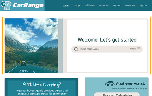
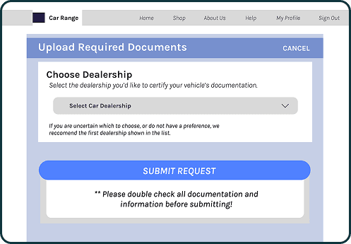
Having decided a general design guide, we compiled an integrated prototype to be tested by users before adding finishing touches. The first prototype combined features from each member and use case, including home, support, about, buy & sell, and profile pages.


Week 9+: Test and Iterate

Evaluation Results
After completing the first high-fidelity prototype, we conducted guided walkthroughs and recorded participant feedback. Users responded most positively to the detailed information on the site, responsive system feedback, pleasant design, , and variety user support resources.
Design Insights
Our guided walkthroughs also provided insight into areas that would be improved in the final design, such as:
Cleaning up the support page links
Adding the AI chatbot to all pages
Prioritizing essential features on the homepage, such as search bar and important deals
Keeping the shop and sell pages consistent with site design (i.e., deleting unnecessary outlines, creating new icons, fixing color contrast)
Demo
Takeaways
What did I learn?
This project was a testament to developing a prototype that was far more complex, while also providing an introduction to industry-standard design programs like Figma. Additionally, this project taught me more about group collaboration and accountability, and how to conduct oneself when communication and effort is imbalanced.
What would I have done differently?
Adding a report fraud feature to secure safe transactions
Reduce the number of fonts
Decrease the amount of interfaces: a lot of resources is good in theory but having everything in one site can lead to confusing navigation
Improve some technical errors of prototype interactions
Organize more in-person work sessions to keep track of equal member participation and effort
Check out my other projects!


