Visually representing a small business through their website.
Peaceful Kingdom Farms
Tools: Figma, Miro
Timeline: 6 week sprint, October/ November 2024
Project Overview
We are.. UXPA Penn State!
We are the only collegiate chapter of the User Experience Professionals Association, hosting career development workshops, Figma sponsored events, and design projects.
Our Client: Peaceful Kingdom Farms
Drove a 6-week design sprint to enhance the digital customer experience for Peaceful Kingdom Farms, a local health and hygiene business.
Timeline
Design Thinking Model
Week 1: Empathize
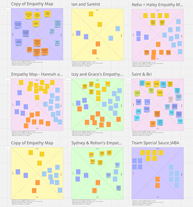
Empathy Maps
About: Empathy maps allow us, the designers, to understand the user’s goals and frustrations when using the website through direct observation.
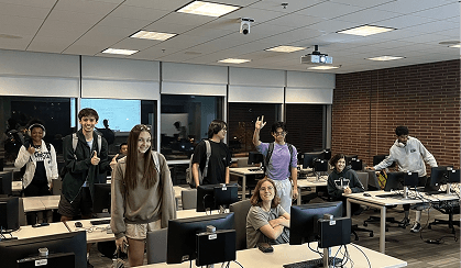
Team Activity: In our first project meeting, we split into pairs, consisting of a User and an Observer. The User navigated the old website and vocalize their thoughts and design critiques. The Observer took note of the User’s thoughts, words, actions, and emotions.
Result: The deliverable helped uncover important user pain points and stylistic issues with the current website, setting a solid foundation to launch the project.
Week 3-6: Define & Ideate
“Peaceful Kingdom Farms needs a website that visually represents their mission of making a positive impact through their products and non-profit, Lagniappe. The current website’s inconsistent aesthetic and poor usability negatively affect the customer’s experience when interacting with the brand. This inhibits business growth and appeal with the Gen-Z audience they hope to attract.”
Problem Statement
Based on the business needs of Peaceful Kingdom Farms and our findings from the empathize stage, we agreed on the above problem statement.
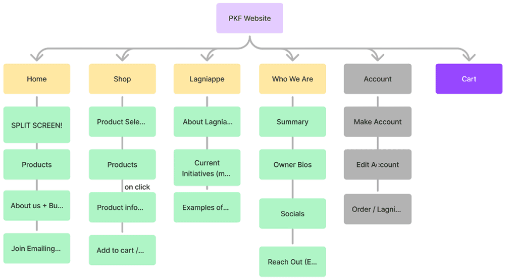
Use Case Diagram + Site Map
About: Use case diagrams organize what use cases the website should support, and site maps list what pages the website should have (based on use cases) and the information architecture of each page.
Team Activity: In groups, we brainstormed use cases that the website needs to support. We converged on one use case diagram to guide the rest of the project. To support each use case, we created a site map organizing the high-level website architecture.
Result: The site map set a foundation for what information should be shown on the website, and how it should be structured. This would eventually help the team stay aligned during the prototype stage.
Week 3: More Ideate
UXPA Gut Designs
About: Gut designs are a UXPA Penn State tradition where we have everyone individually (or collaboratively) design the homepage based on their own gut. There are no right or wrong designs, only putting ideas to the canvas.
Team Activity: Started with individually hand drawing Gut Designs of the home screen. Then, we all made our Gut Designs in Figma. Ended the meeting by offering feedback on everyone’s designs.
Result: This activity enabled everyone to share their unique ideas on these design patterns, resulting in alternatives to critique and converge on going into the prototype stage. Additionally, this activity encouraged constructive feedback for everyone’s designs, fostering an environment where no opinion is excluded.
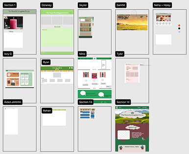
Week 4, 5, & 6: Prototype
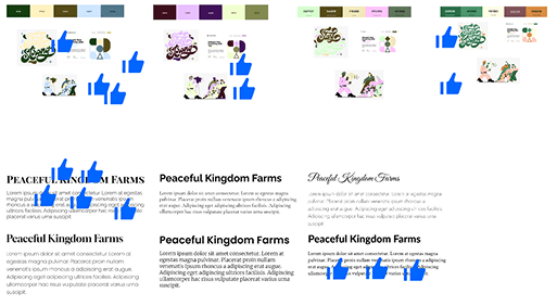
Choosing Themes
Team Activity: Using themes from our Gut Designs, we gathered possible color schemes, fonts, and UI components for the team to choose from. We voted, modified, and finalized themes that best aligned with the story we were trying to tell.
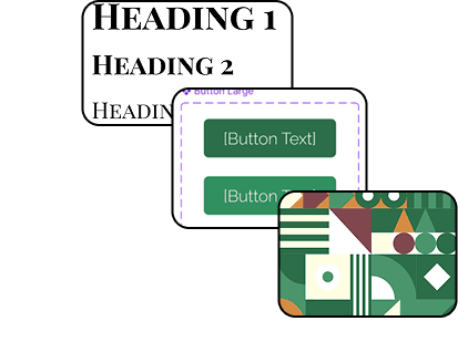
Style Guide
Designed a style guide in Figma to ensure consistency and scalability across our designs. The style guide streamlined color scheme, font family, UI components, and spacing/sizing guidelines.
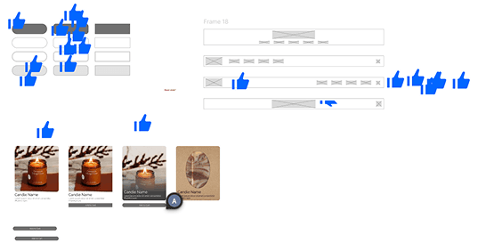
Prototyping
Designed each page based on our sitemap, using the design system to style and structure the UI. Continuously offered and leveraged feedback on our designs, always seeking ways to improve the prototype.
Week 6+: Test
Client Feedback
After showing our prototype to the client, we implemented client feedback and aided in product photography as we prepared to hand over the design to the client.
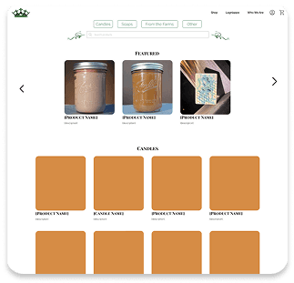
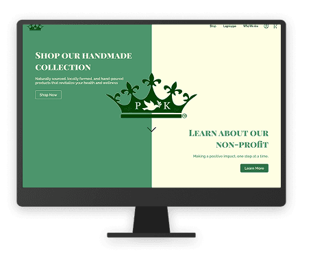
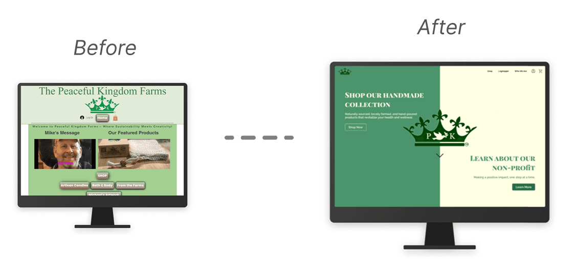
Results
Takeaways
Client Communication. It's important to remain flexible and understanding of a clients ability to communicate. Learning how to best get in touch with your client is crucial to incorporating project feedback.
Issues in Implementation. Things don't always go to plan: clients may not always be able to completely implement a design on their own. Considering how and when the final design will be implemented is something that should be addressed at the beginning of the project, so that necessary adjustments may be put into place to make the transition from concept to product as seamless as possible.
Check out my other projects!


