Introduction to UX: Mock-application Design
Helping Home
FALL 2023 Semester Project, HCDD 113
A collaborative effort by Skyler Koba, Willow Hovey, and Noreaga Wells
Timeline: 12 week sprint September/December 2023

Project Overview
Problem Scenario
According to the Domestic Violence National Hotline, more than 65% of men and women experience domestic abuse within their lifetime. During the COVID 19 pandemic, individuals experiencing domestic abuse were essentially trapped with their abuser, making it incredibly difficult to seek out help during and after isolation. While resources and shelters have been made available, a top concern for these individuals is accessing assistance with discretion.
Our Solution
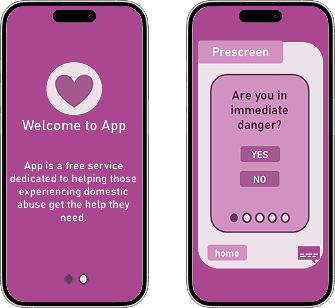
A mock app that aims to anonymously connect and match individuals to local Domestic Violence shelters based on their needs. Users can choose to reach out to intake agents on their own accord, to provide an extra level of security while being in such a vulnerable position.
Timeline
Design Thinking Model
Week 1 & 2: Empathize
Personas
Collaboration: After compiling lists of problem areas arising from the COVID-19 pandemic, our team then compared them narrowed down our options from there. The problem area we chose to focus on, domestic abuse and violence, was pitched by MacLaine Funsch, who has been excluded in this study for all other design stages due having dropped out of the project.
Activity: Gathered secondary research to develop individual personas for possible stakeholders, including watching day in the life vlogs on social media and noting struggle areas. Using our findings, we individually created the personas.
Result: This exercise offered us a more complete understanding of our user base and their pain points, allowing us to feel ready to begin defining the project scope.

Week 3-6: Define & Ideate
Task Analysis
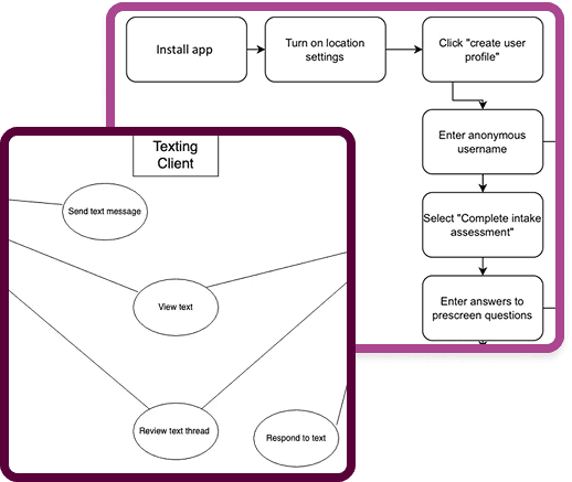
Activity: Our group was then asked to break up our requirements into tasks, which would later be generalized as use cases. Our initial task analysis outlined the process as depicted in the image to the right.
Result: After coming up with the tasks, each of our members chose one to flesh out during prototyping.
Use Case Diagram
We began identifying the use cases, by constructing a Use Case Diagram as a team. Willow started the diagram, and we all reviewed it from there. The image to the left depicts our work.
Scenarios & Use Case Specification
After diagramming, we each individually had to write out a Use Case Specification, in which an actor was used to simulate a use case interaction with potential technology. We then evaluated our design insights.
Week 7 & 8: Prototype
Sketches
For the prototyping stage, we each chose tasks from the task analysis to begin sketching out potential interfaces for. I included sketches of both a mobile and desktop interface, but for relevancy purposes as my group chose to go with a mobile interface, I did not include the desktop images in this summary.
Wireframes
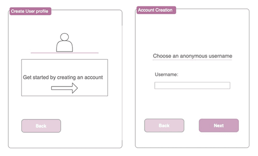
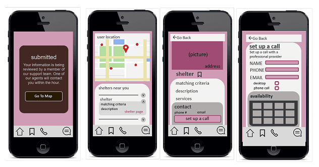
After cementing a general concept, we moved on to developing our first prototypes/wireframes. Below are the groups respective prototypes (Figure 2-4).
High-fidelity Prototype
After reviewing each others wireframes, we compiled an integrated version of our high-fidelity prototype that would be submitted before the final demo. The integrated prototype combined features from each member, and improved upon cohesion, stylistics, and utility.

Week 9+: Test and Iterate
Evaluation Results
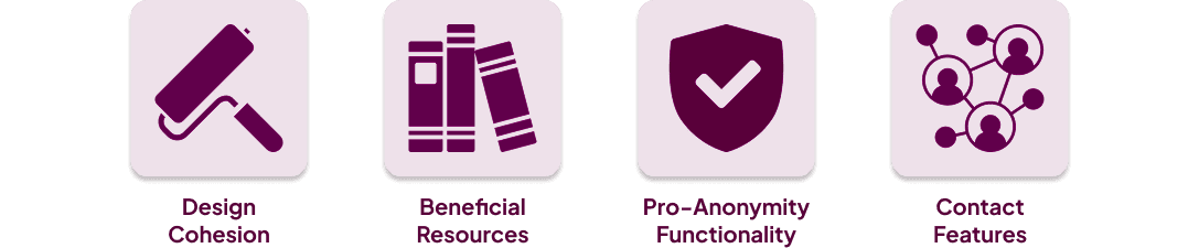
Upon completing the first high-fidelity prototype, we each conducted cognitive walkthroughs and recorded user feedback. Participants positively responded to the cohesive, welcoming design, types of resources, anonymous functionality, and variety of contact features.
Design Insights
Participant feedback also offered us insights into areas of the design that could be improved, including:
Making welcome message more personal
Alter prescreen questions to provide a variety of answers
Expand resources on the home page (ex. informational articles, blogs, community groups)
Develop ability to autofill information while setting up calls for users with profiles
Add clarity about bottom chat icon (ex. “24/7 support”) to avoid user confusion
Provide a clear option to opt in or out of emails
Demo
Takeaways
What did I learn?
This project was my introduction to the world of UX/UI. I learned a lot about the Design Thinking Model, the benefits and challenges of remotely collaborating with a design team, and how to develop a prototype to present a product idea.
What would I have done differently?
Flesh out all other resource buttons and screens to lead to necessary pages beyond what we were able to achieve in our given due date
Add a faux app cover to increase discretion (ex. creating a small game that the app opens up to in case somebody’s phone is looked through)
Make creating an account optional, password is mandatory for discretion. (email would therefore only be necessary information when scheduling a call). Can add an exit out button on the introduction page of the app.
Adding fail-safes such as “are you sure” when clicking emergency call.
Increasing the variety of the survey questions/answers to be tailored to the individuals experience
Check out my other projects!


